SwiftyChat
A lightweight, cross-platform SwiftUI chat UI framework.
Perfect for AI chatbots, customer support, and messaging apps.


Installation • Quick Start • Message Types • Themes • AI & Chatbot • Custom Cells
Also available for Flutter.
Why SwiftyChat?
- 11 message kinds — text, image, video, location, carousel, quick replies, link previews, contacts, loading indicators, and more
- 5 demo themes with full style customization via SwiftUI environment
- Cross-platform — iOS 17+ and macOS 14+ from a single codebase
- Lazy message rendering with linear header calculation and remote image loading
- Chatbot-ready — carousels, quick replies, and loading states designed for AI/bot interfaces
- Lightweight — Kingfisher is the only package dependency
- Custom message cells for any type you need
- Landscape orientation support with auto-scaling cells
- User avatars with configurable positioning
- Keyboard dismiss on tap and scroll
- Scroll to bottom or to a specific message
- Picture-in-Picture video playback
- Per-corner rounding on text bubbles
- Multiline input bar (BasicInputView)
- Attributed string / markdown support
Preview
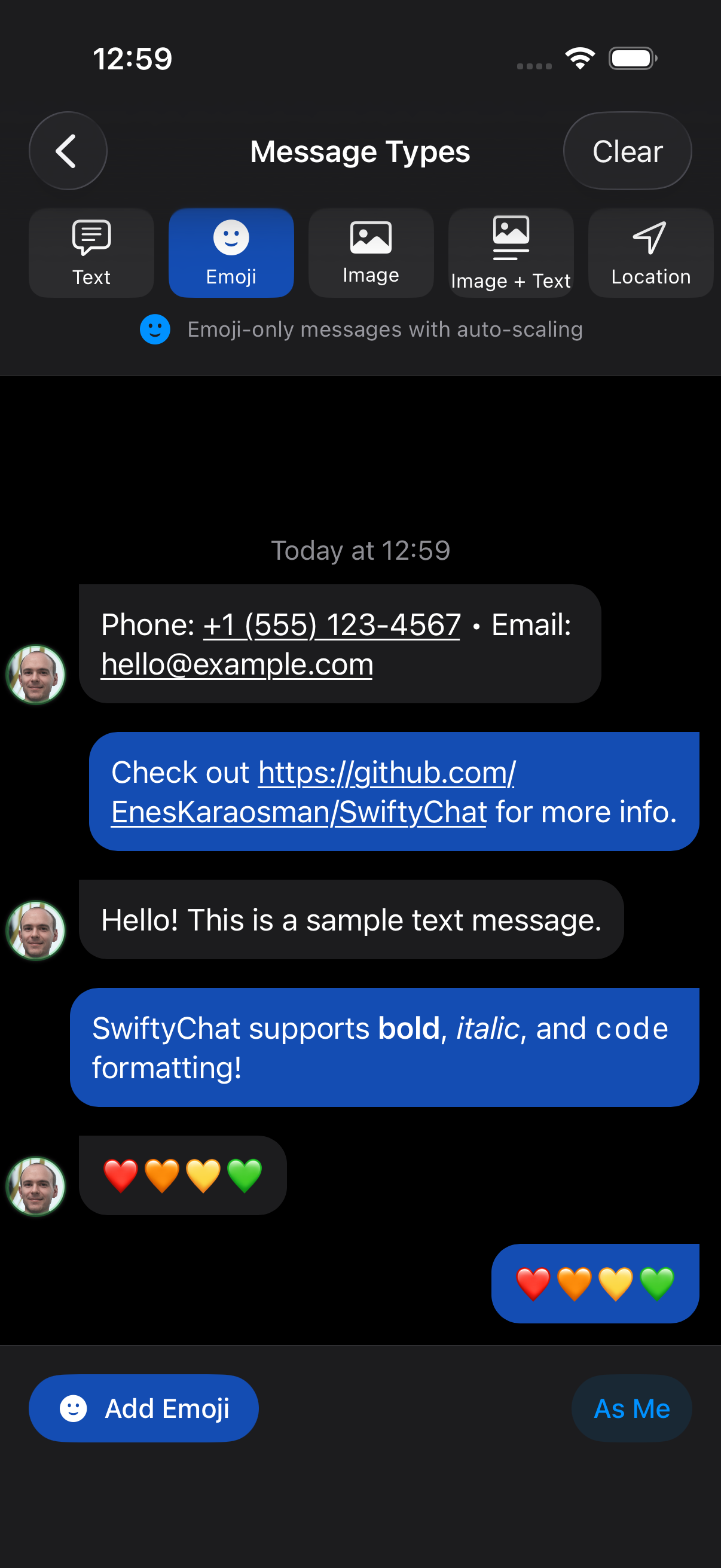
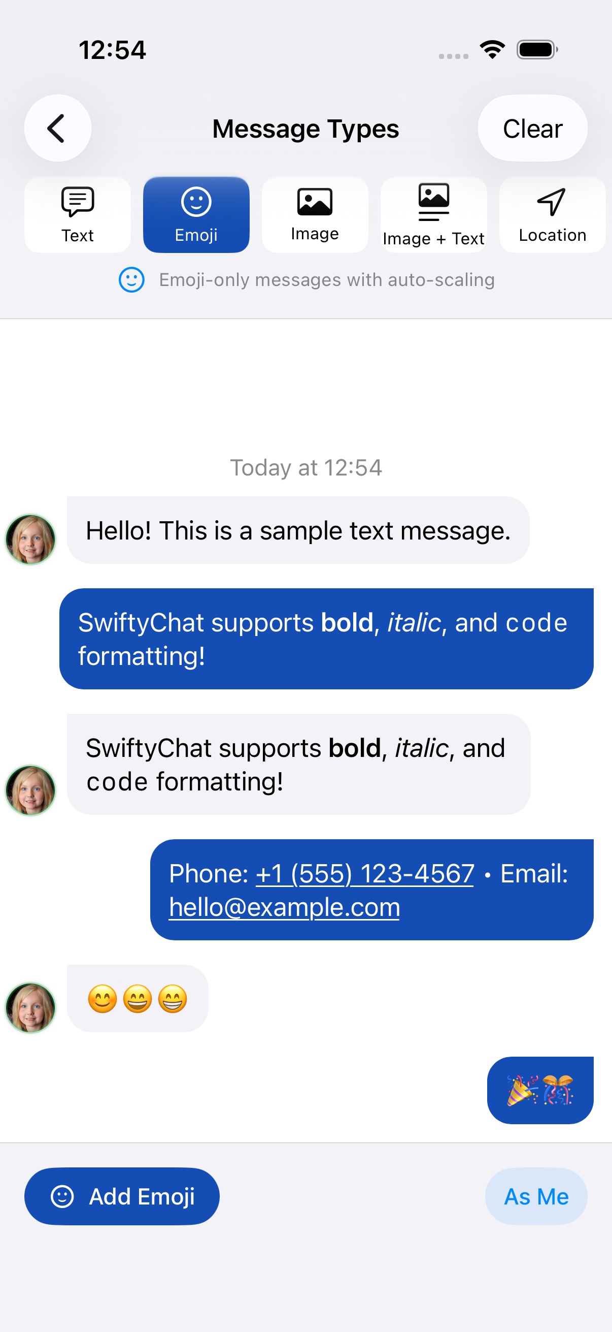
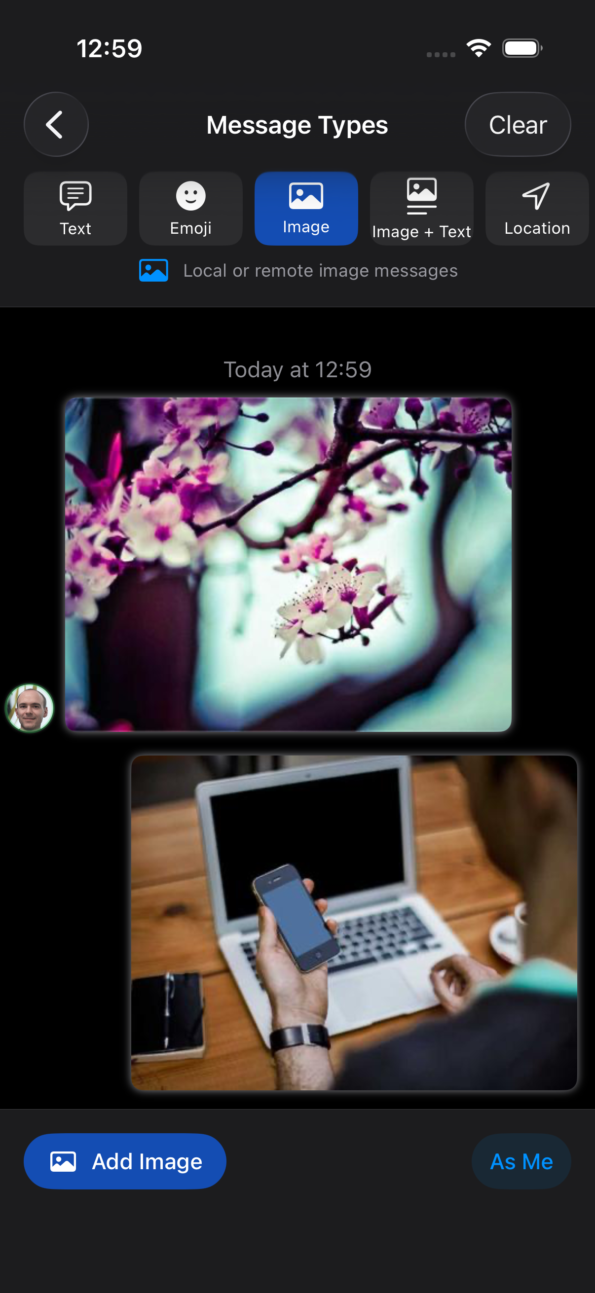
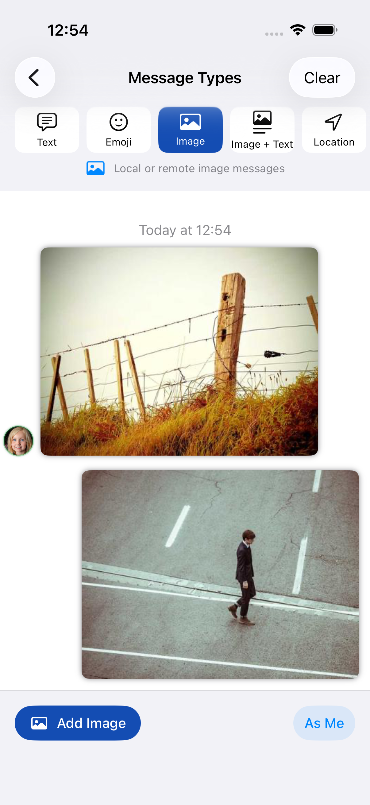
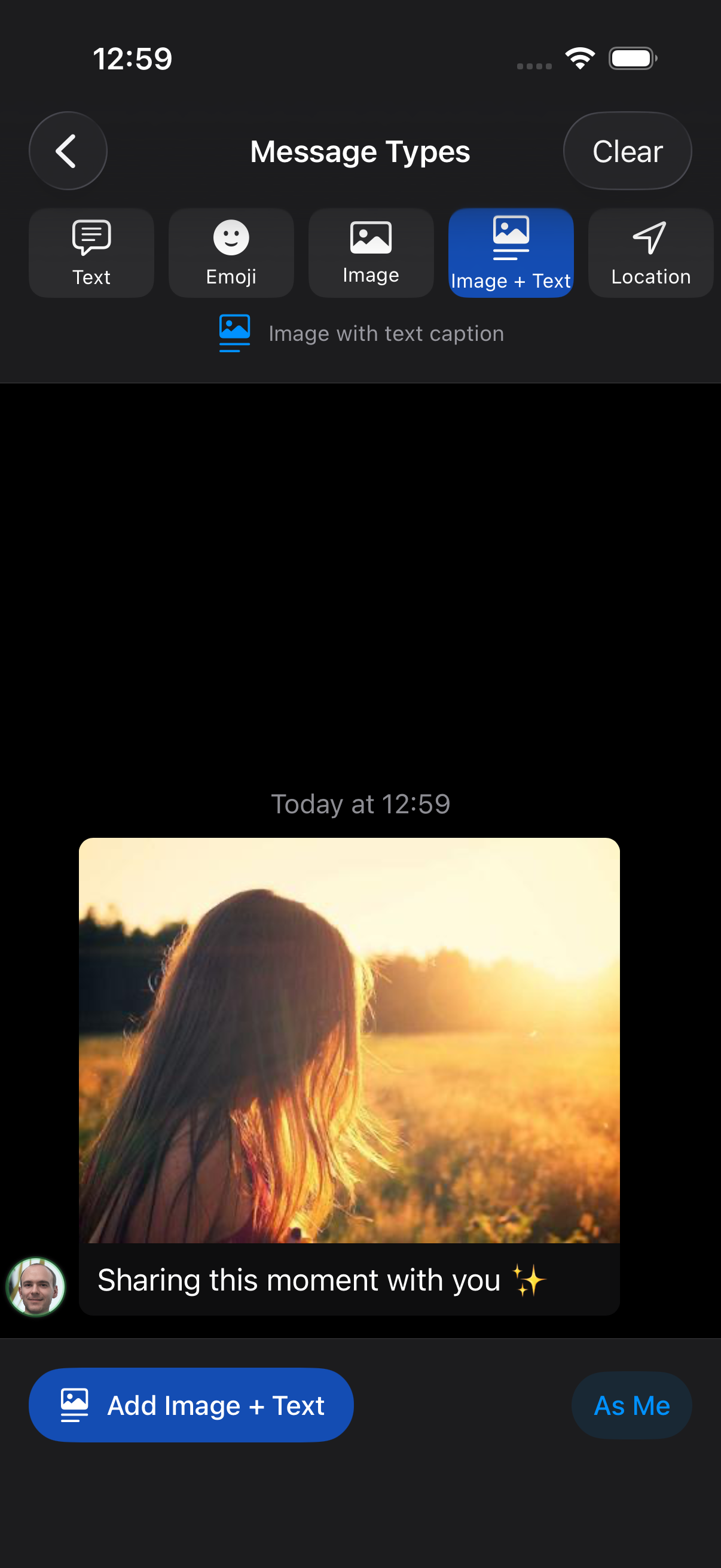
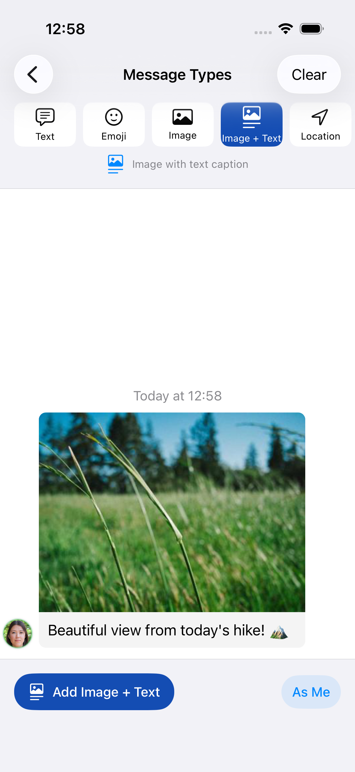
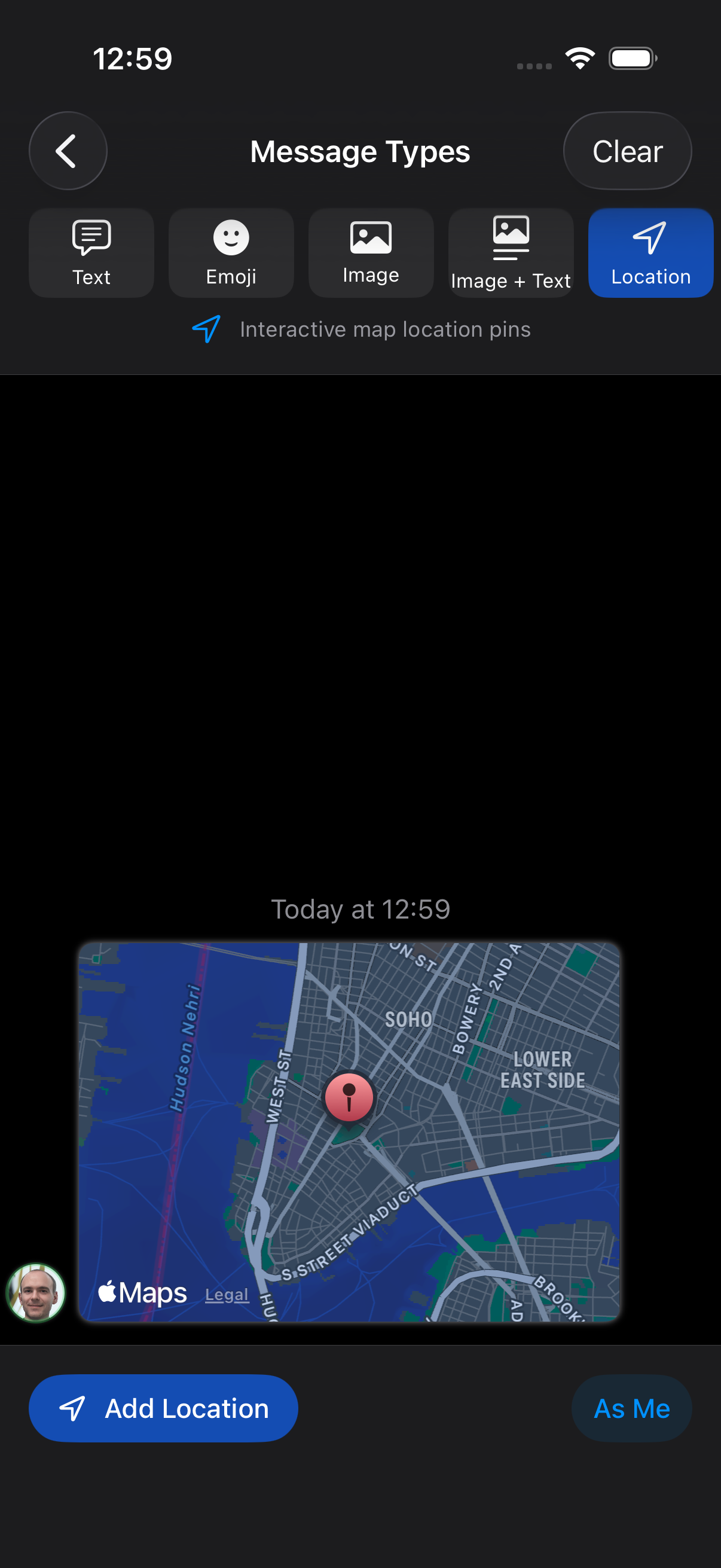
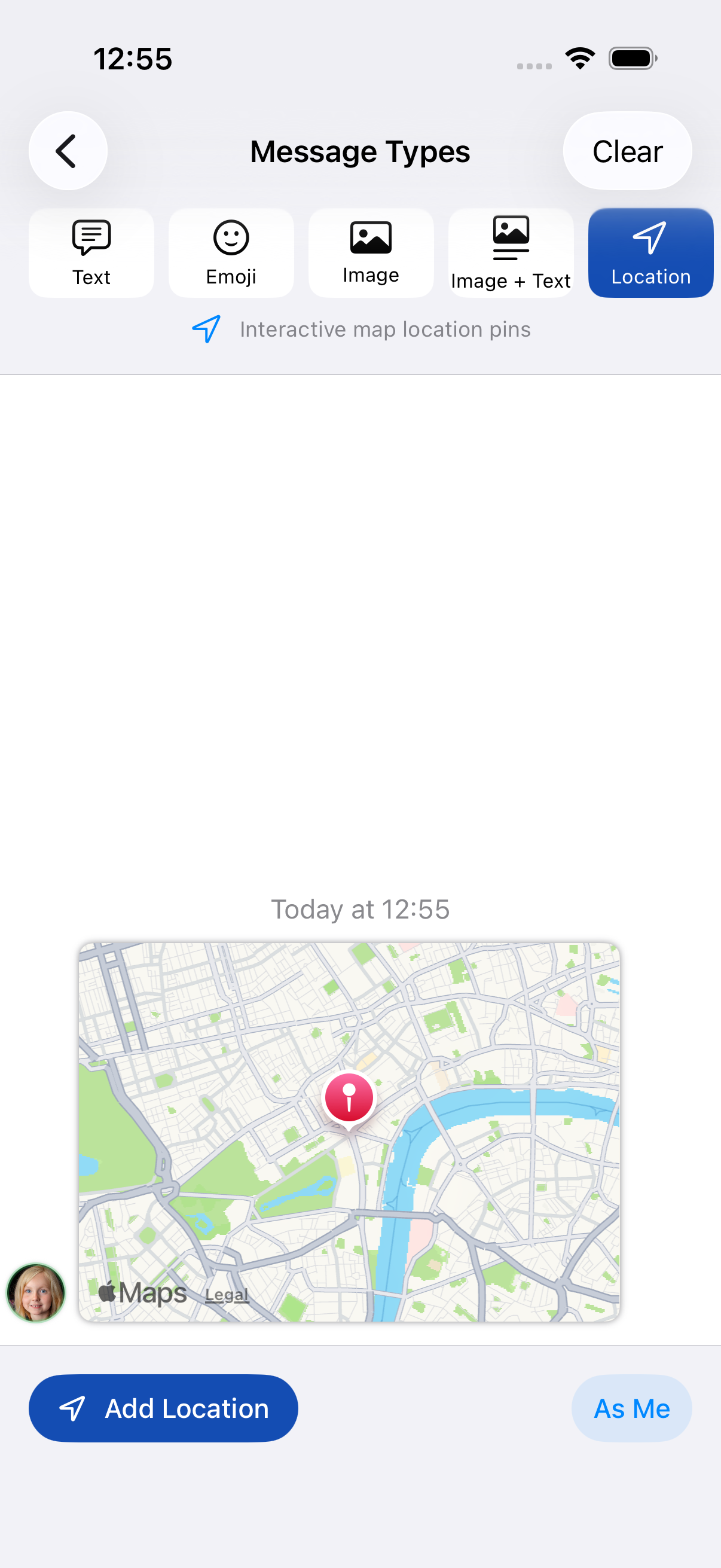
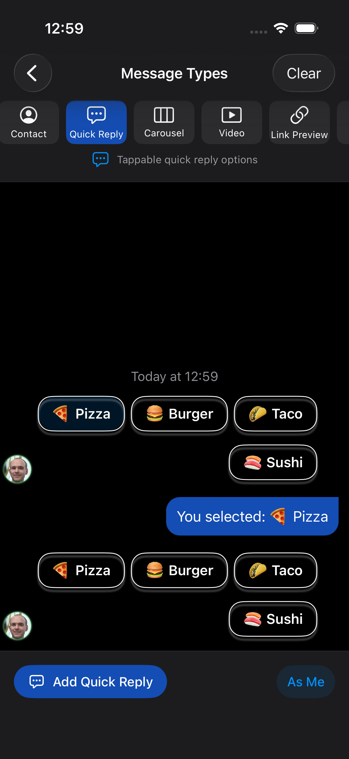
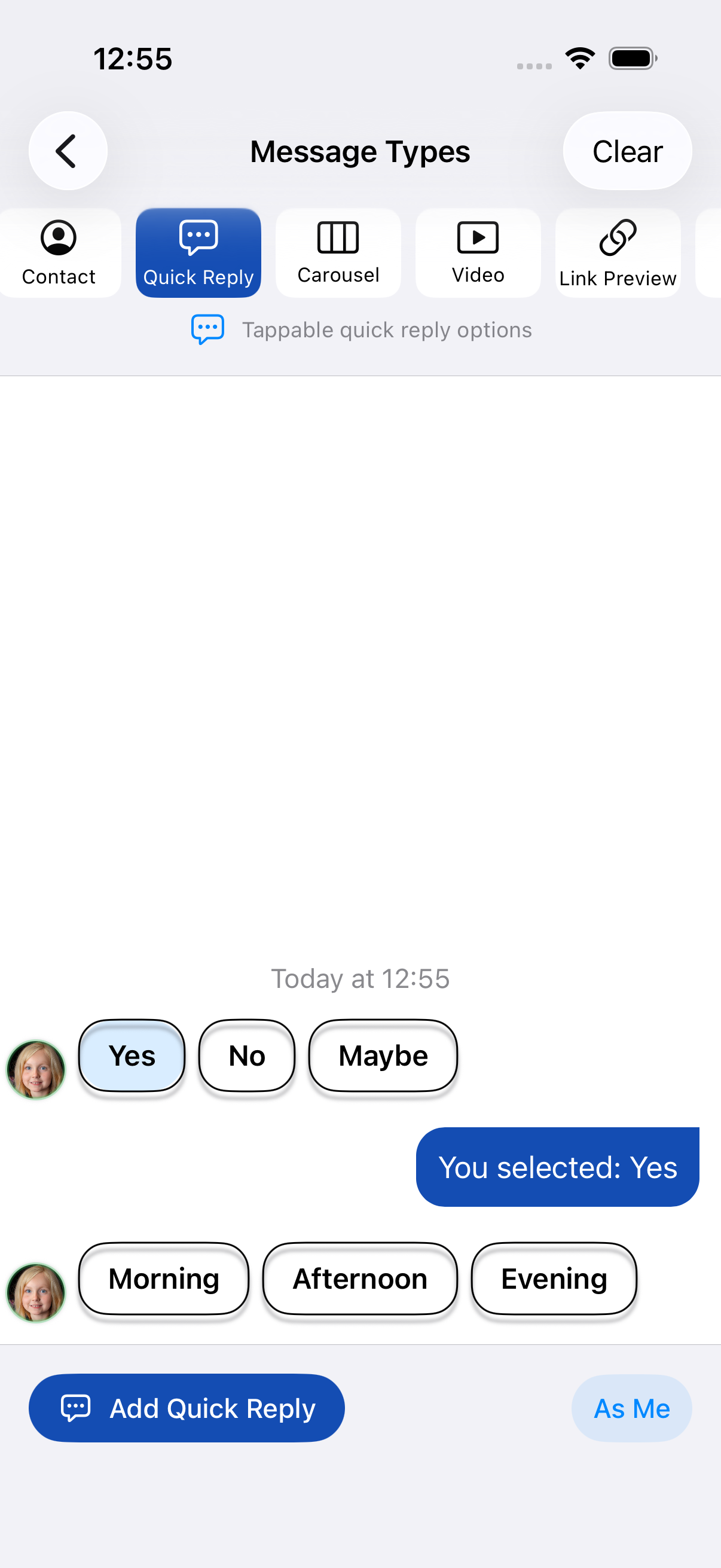
Every message kind is shown below. These are current captures from the iPhone 17 Pro simulator; the screenshots follow your light/dark preference. Open the complete message gallery to compare both appearances side by side.
| Text and emoji | Images | Images with captions |
|---|---|---|
  |
  |
  |
| Locations | Contacts | Carousels |
|---|---|---|
  |
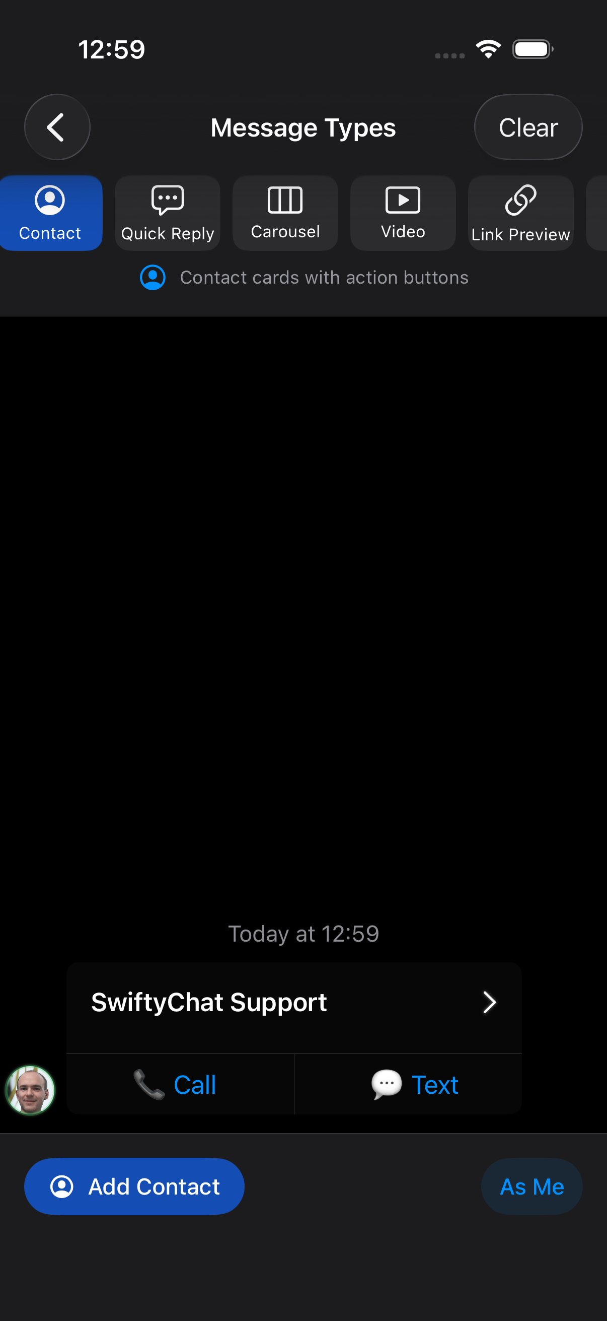 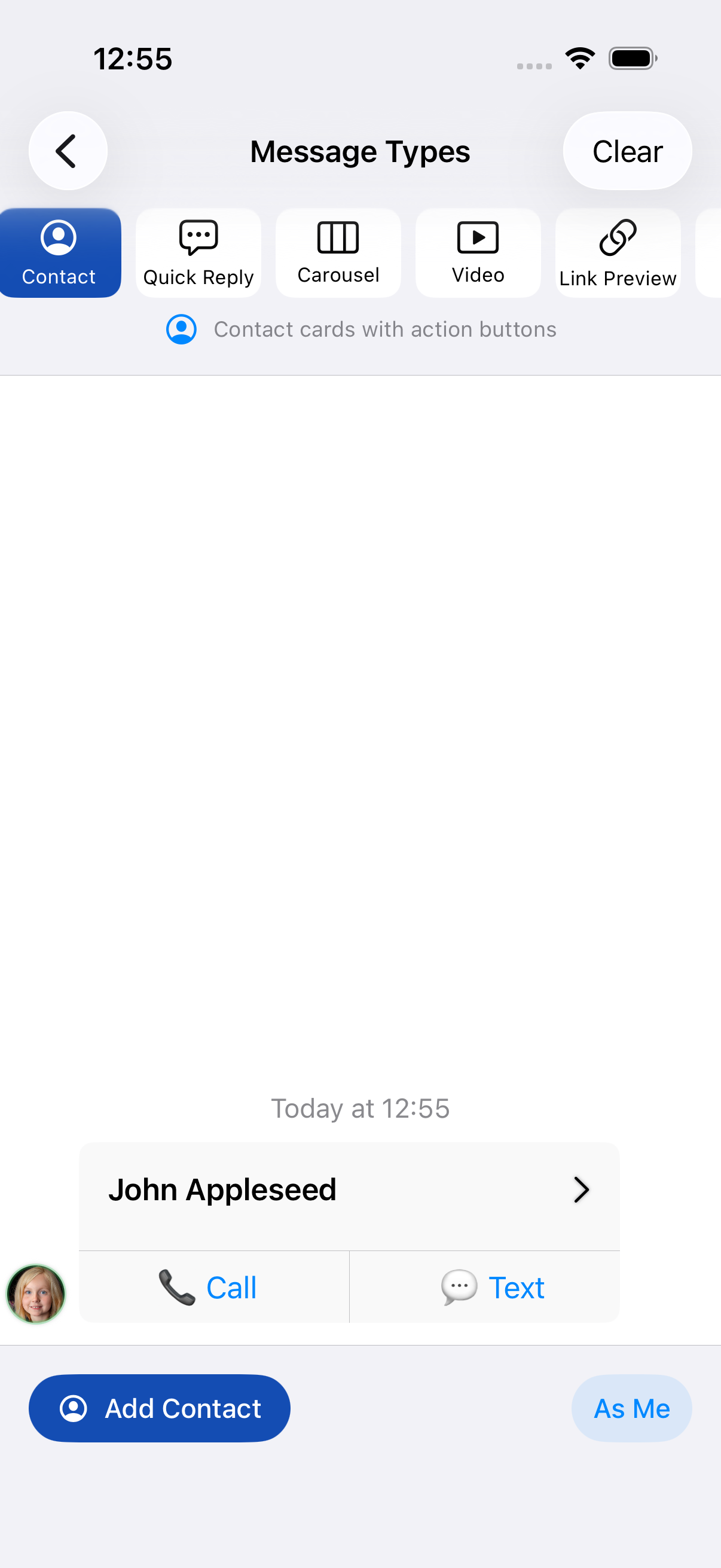 |
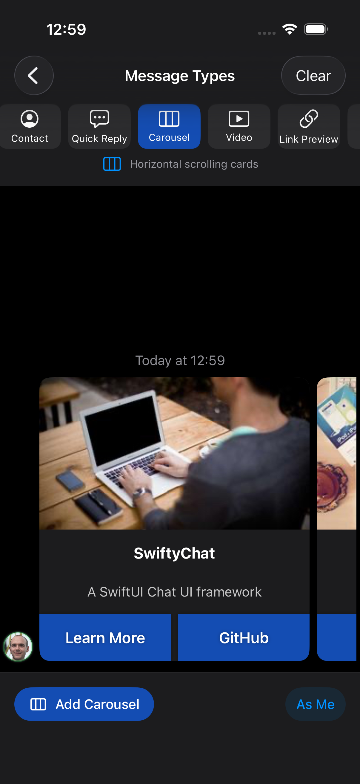 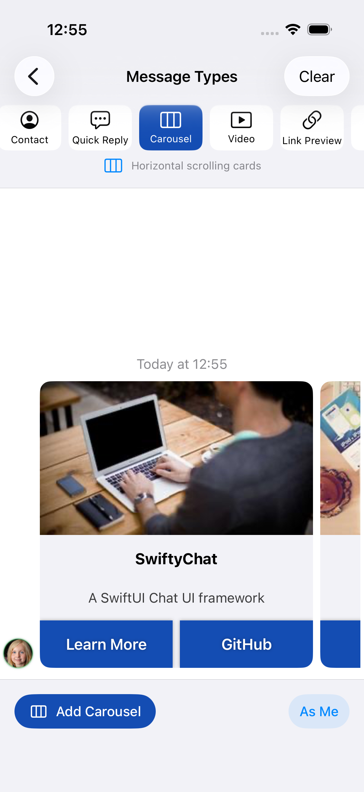 |
| Video | Link previews | Quick replies |
|---|---|---|
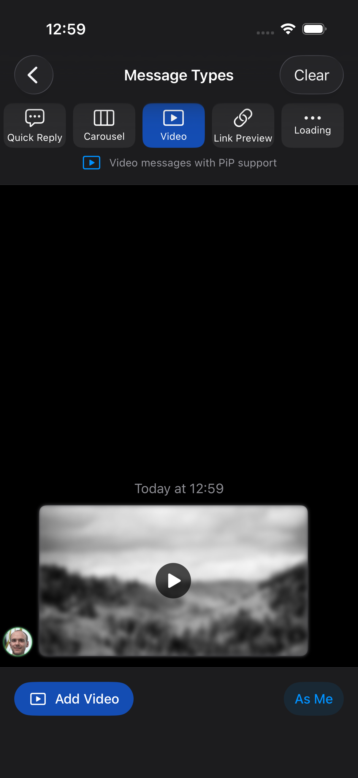 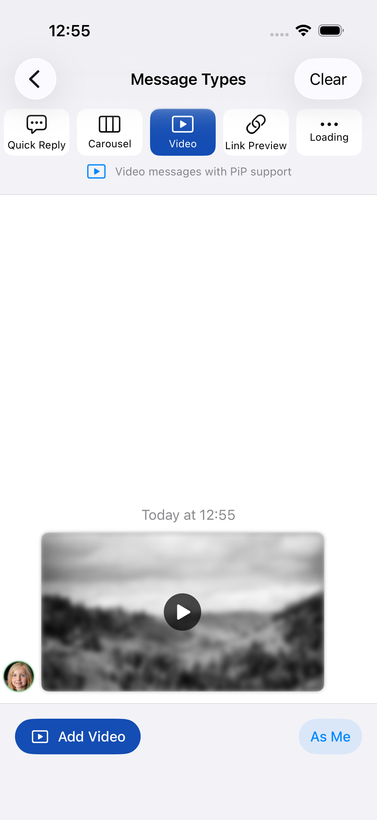 |
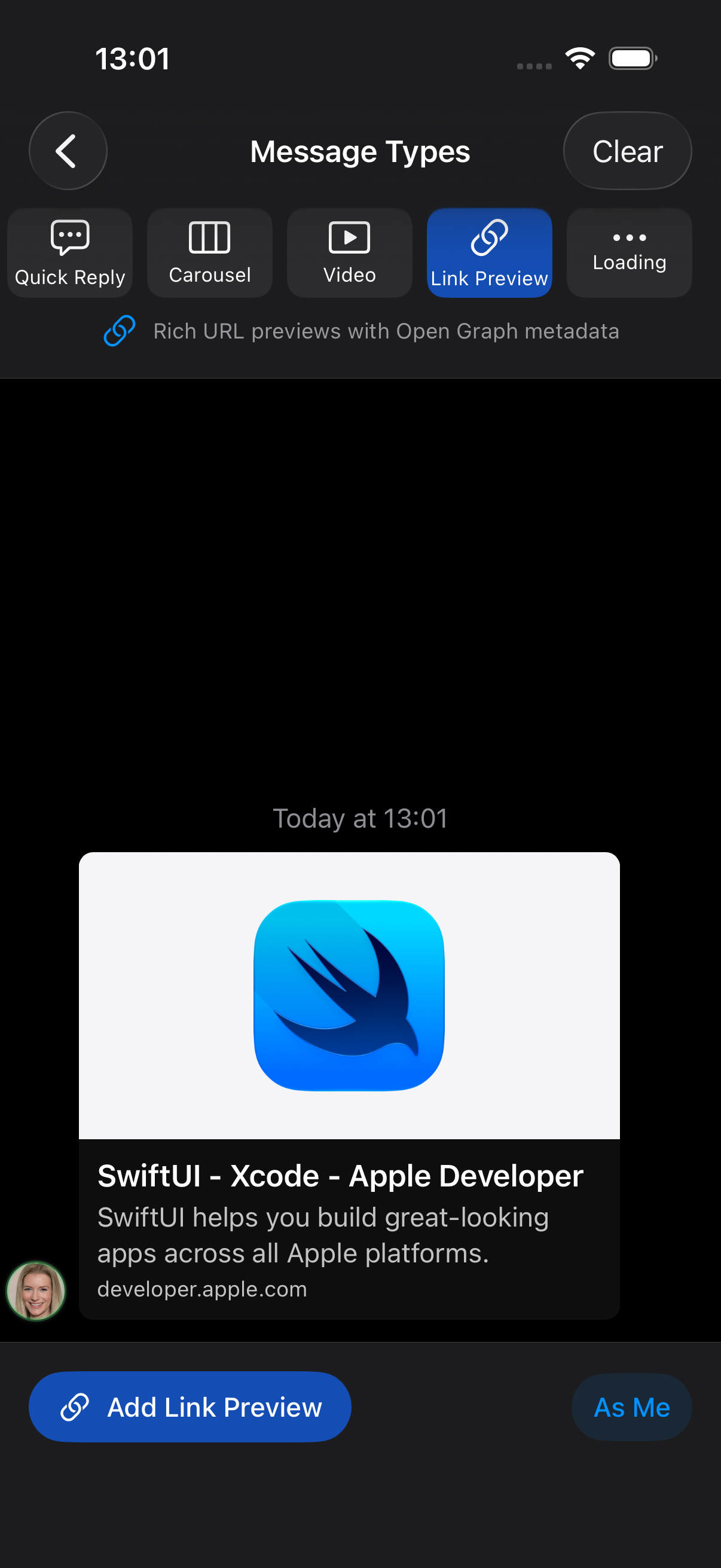 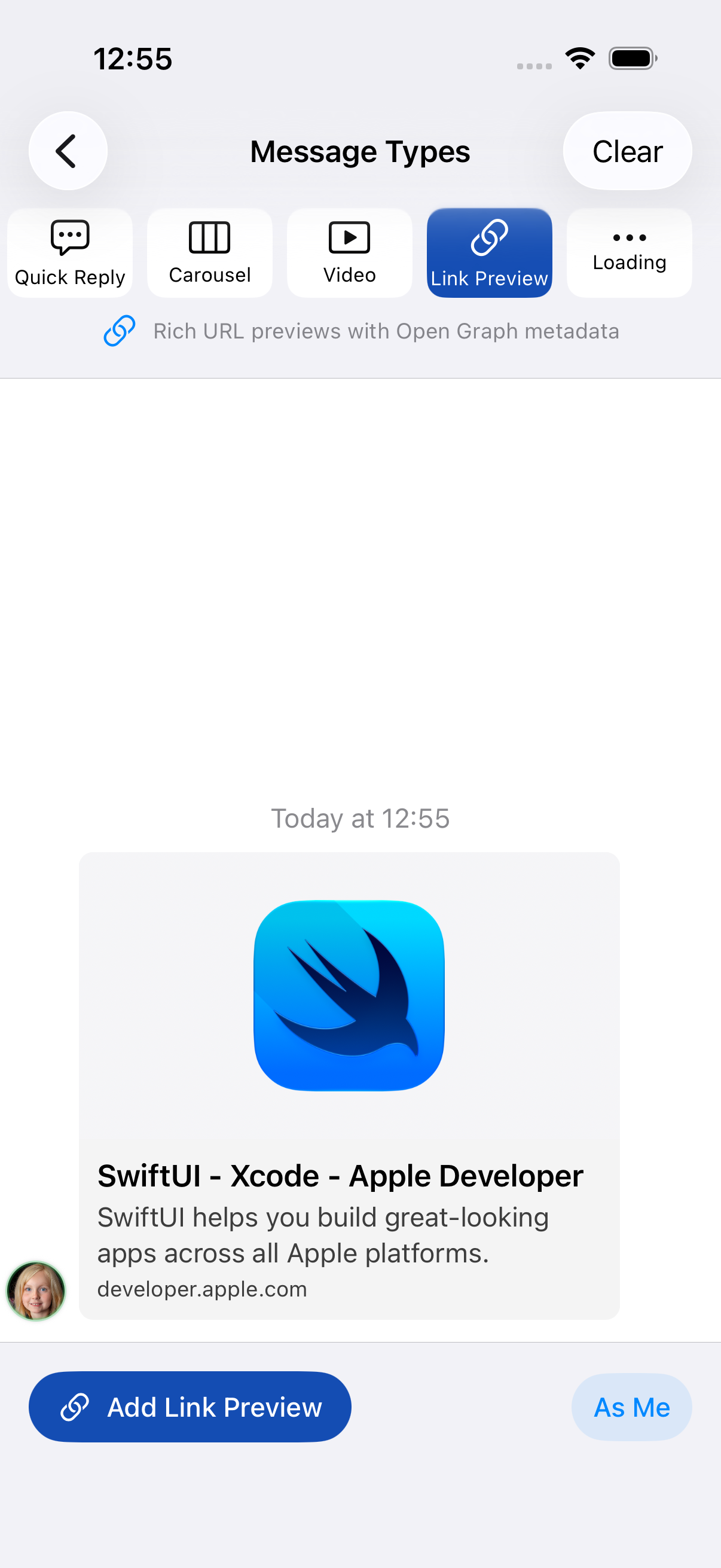 |
  |
Loading and custom content
These close-ups are rendered from the library using local fixtures. Custom cells can contain your own SwiftUI views.
| Loading indicator | Custom SwiftUI cell |
|---|---|
  |
  |
See the style guide for reply quotes, native keyboard layout, and all five demo themes.
Installation
Swift Package Manager
Add SwiftyChat in Xcode via File → Add Package Dependencies:
https://github.com/EnesKaraosman/SwiftyChat.git
Or add it to your Package.swift:
dependencies: [
    .package(url: "https://github.com/EnesKaraosman/SwiftyChat.git", from: "4.3.0")
]
Quick Start
import SwiftyChat

struct ContentView: View {
    @State private var messages: [YourMessage] = []
    @State private var message = ""
    @State private var scrollToBottom = false

    var body: some View {
        ChatView(messages: $messages, scrollToBottom: $scrollToBottom) {
            BasicInputView(
                message: $message,
                placeholder: "Type something",
                onCommit: { messageKind in
                    messages.append(/* your message */)
                }
            )
        }
        .environment(\.chatStyle, ChatMessageCellStyle())
    }
}
YourMessagemust conform to theChatMessageprotocol (which has an associatedChatUsertype). See the SwiftyChatDemo app for a complete implementation.
Message Kinds
public enum ChatMessageKind: CustomStringConvertible {
    case text(String)              // Auto-scales for emoji-only messages
    case image(ImageLoadingKind)   // Local (UIImage/NSImage) or remote (URL)
    case imageText(ImageLoadingKind, String) // Image with caption
    case location(LocationItem)    // MapKit pin
    case contact(ContactItem)      // Shareable contact card
    case quickReply([QuickReplyItem]) // Tappable options, auto-disables after selection
    case carousel([CarouselItem])  // Scrollable cards with buttons
    case video(VideoItem)          // Video with PiP support
    case linkPreview(LinkPreviewItem) // Displays URL metadata supplied by your app
    case loading                   // Animated loading indicator
    case custom(Any)               // Your own message type
}
Customization
Input View
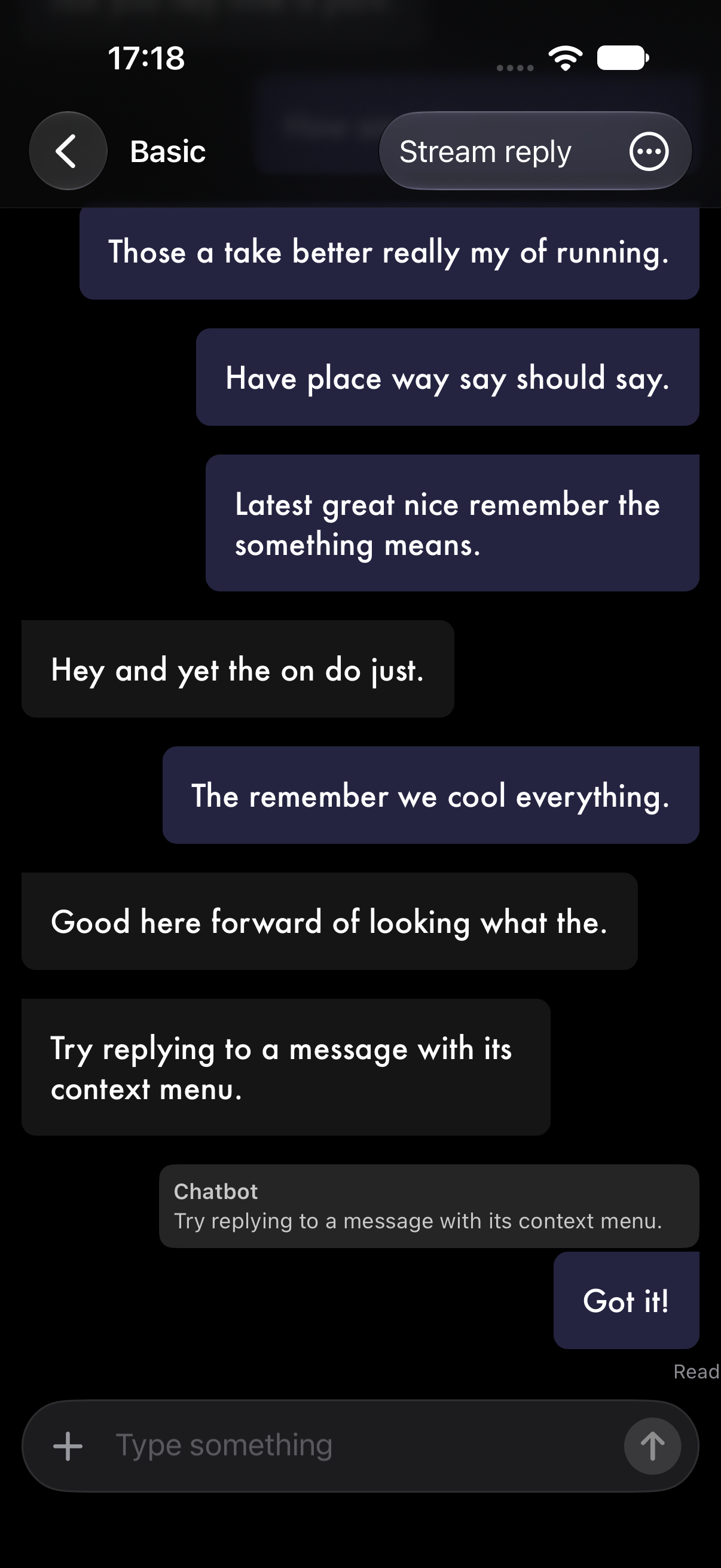
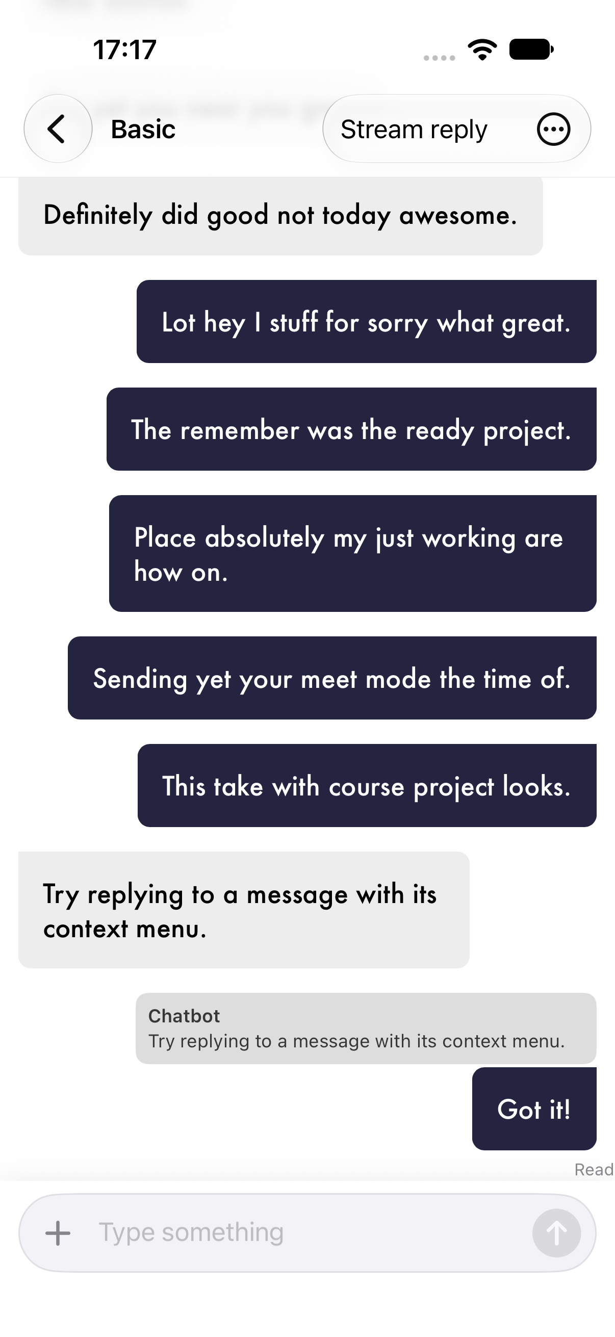
A built-in BasicInputView is included. Use it as-is, or build your own — ChatView accepts any view via its inputView closure.
Version 4.3.0 includes a unified composer with an optional attachment button. Provide onAttachment to open your picker; existing initializers continue to work:
BasicInputView(
    message: $message,
    placeholder: "Write a message…",
    onAttachment: { isPickerPresented = true },
    onCommit: sendMessage
)
| Composer | With keyboard |
|---|---|
  |
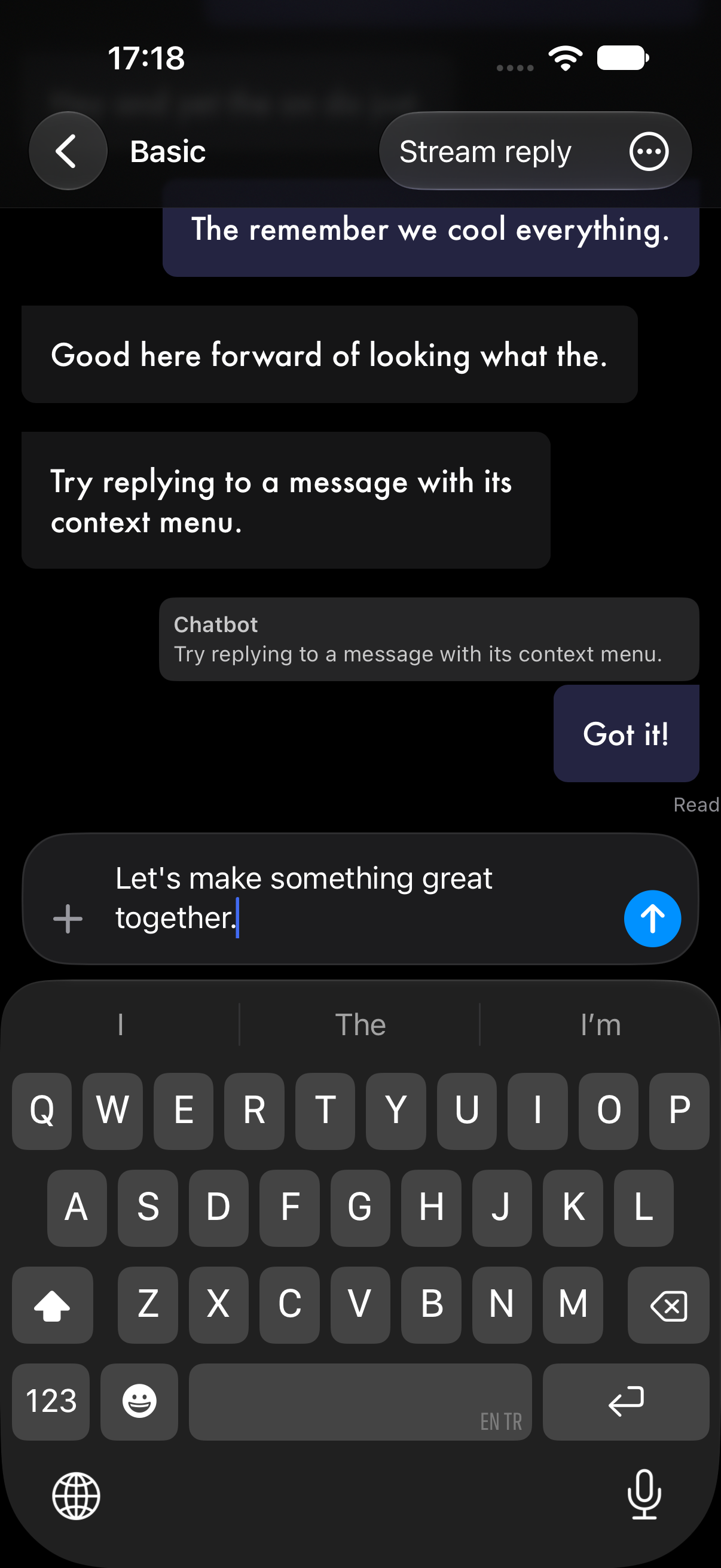 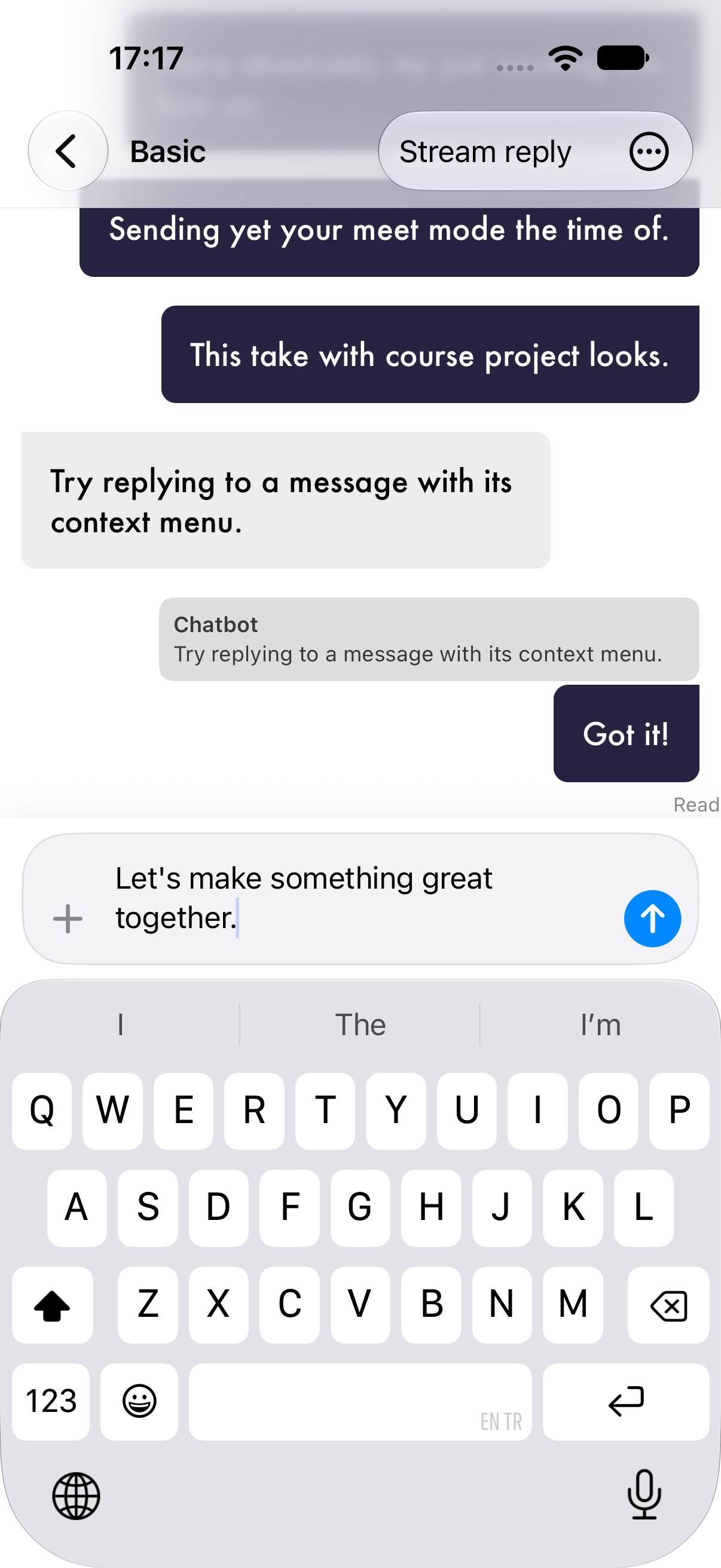 |
The demo's text chat adds pagination, streaming replies, reply quotes, delivery status, and an iOS photo/video picker. ChatMessage has optional replyPreview and deliveryStatus properties with nil defaults, so existing message types still compile.
Conversation navigation
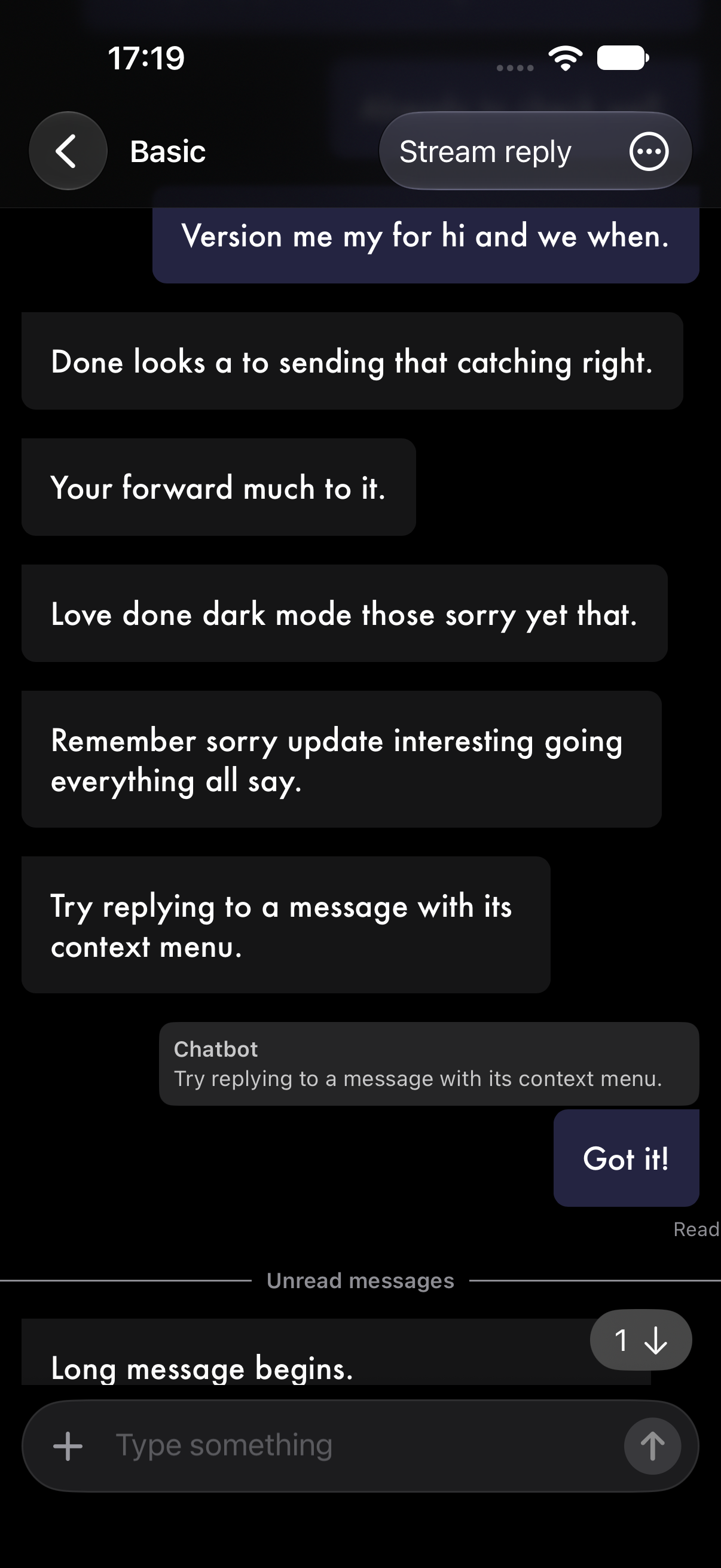
Version 4.3.0 adds unread indicators, a scroll-to-latest button, reply navigation, and retry actions:
ChatView(messages: $messages) { /* input view */ }
    .unreadMessages(unreadMessageIDs)
    .onReachedBottom { newestID in
        markRead(through: newestID)
    }
    .onRetryMessage { message in
        resend(message)
    }
The app owns unreadMessageIDs, read persistence, and sending. The divider and count include only loaded incoming messages whose IDs are in that set; pagination and edits do not create unread messages. Use .showsScrollToBottomButton() to enable the button without unread tracking.
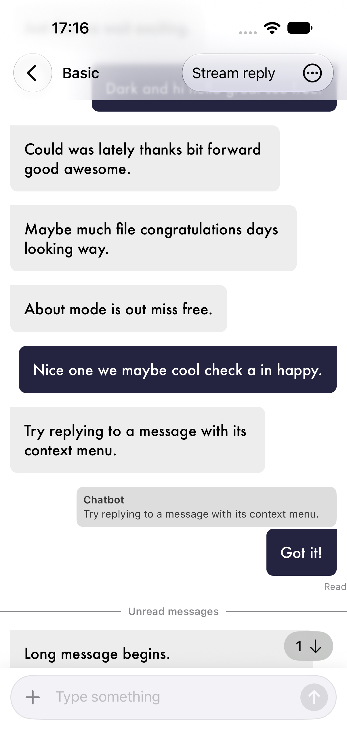
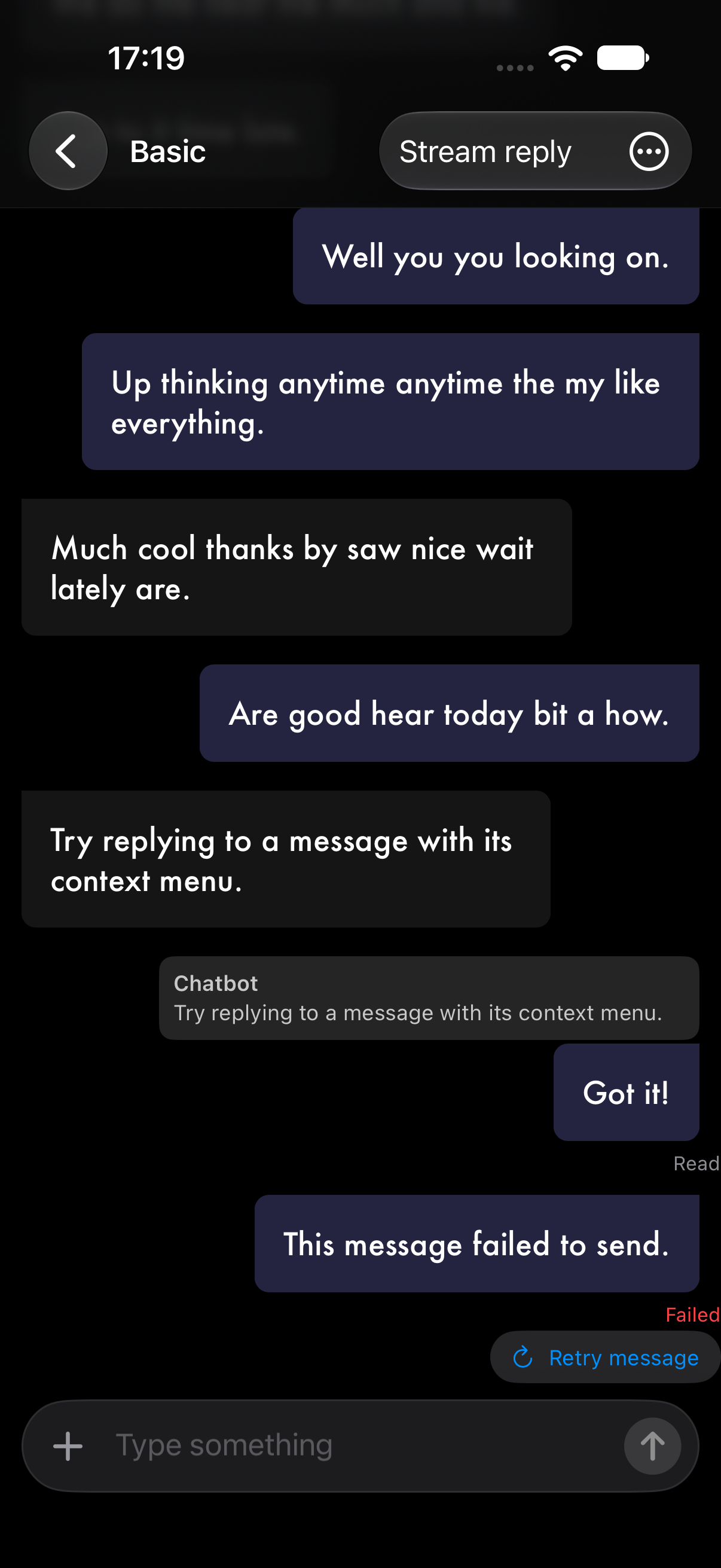
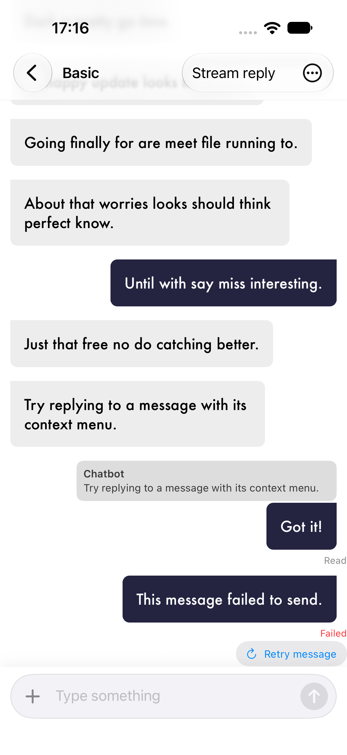
Set optional ChatMessage.replyToMessageID to make a quote navigate to a loaded original. Use .onReplyPreviewTapped to load an original that is absent, then set the existing scrollTo binding after inserting it. Existing message models inherit a nil target. Retry controls appear only for failed outgoing messages when a retry handler is supplied; update deliveryStatus as sending progresses.
The Text Chat Example demonstrates these actions through its Demo actions menu.
| Unread messages and return to latest | Reply quote and failed-send retry |
|---|---|
  |
  |
Link previews
Link metadata is fetched only when your app calls the optional helper. Keep one loader instance to reuse its in-memory cache:
let loader = LinkPreviewMetadataLoader()
let preview = try await loader.preview(for: url)
let kind = ChatMessageKind.linkPreview(preview)
The helper uses Apple's LinkPresentation to retrieve a title and host. It does not provide a description or image URL; supply your own LinkPreviewItem for richer previews. The macOS host app needs the network client entitlement to fetch remote metadata.
Styling
Every visual aspect is customizable through ChatMessageCellStyle — text styles, edge insets, avatar styles, and cell styles for every message type. Inject via .environment(\.chatStyle, yourStyle). The default text and surface colors support light and dark appearance. When supplying custom colors, check their contrast on your app's background in both modes.
See Styles.md for the full style reference, Accessibility.md for Dynamic Type and accessibility behavior, and CustomMessage.md for custom cell types.
Pre-built Themes
| Theme | Description |
|---|---|
| Modern | Clean blue, minimal design |
| Classic | Traditional blue messaging |
| Dark Neon | Cyberpunk with glowing accents |
| Warm Sunset | Orange and coral tones |
| Nature | Green tones inspired by forests |
These presets live in the demo app. Modern, Classic, Warm Sunset, and Nature follow the system appearance. Dark Neon explicitly uses a dark appearance. See Styles.md for customization and screenshots.
AI & Chatbot Use Case
SwiftyChat is especially well-suited for AI and chatbot interfaces. Built-in support for carousels, quick reply buttons, loading indicators, and link previews means you can build a rich conversational UI without custom cells:
struct Reply: QuickReplyItem {
    let title: String
    var payload: String { title }
}

// Show a loading indicator while the AI responds
messages.append(Message(user: bot, messageKind: .loading))

// Replace with the actual response
messages[messages.count - 1] = Message(
    user: bot,
    messageKind: .text("Here's what I found...")
)

// Offer follow-up options as quick replies
messages.append(Message(
    user: bot,
    messageKind: .quickReply([
        Reply(title: "Tell me more"),
        Reply(title: "Something else"),
    ])
))
Building a ChatGPT-style app, a customer support bot, or an in-app assistant? SwiftyChat gives you the UI layer so you can focus on the AI logic.
Testing
Run package tests with swift test, including default color contrast checks and component rendering in light and dark mode. The iOS demo also has Maestro smoke flows for basic chat controls, pagination, the guided conversation, themes, message actions, and the advanced example. After building and installing SwiftyChatDemo on a booted iOS simulator, run maestro test --udid <simulator-udid> Tests/Smoke. See appearance verification for running both system appearances and regenerating the screenshots.
Contributing
Contributions are welcome! Whether it's a bug fix, new feature, documentation improvement, or a new theme — we'd love your help.
See CONTRIBUTING.md for guidelines.
Acknowledgments
Inspired by MessageKit (UIKit) and Nio (SwiftUI).
License
SwiftyChat is available under the Apache 2.0 license. See the LICENSE file for details.


No comments yet.
to comment.